
The Best Warm Neutral Paint Colors I’ve Used in My Home
Why I Keep Coming Back to Warm Neutrals
I've learned that paint can change almost everything about how a room feels.
I love color, but when it comes to our walls, I almost always come back to warm neutrals in the main living spaces. They give me a soft backdrop for the things I really want to notice, the furniture, artwork, warm wood, brass, and all the details that make a room feel like home.
Finding the right neutral, though, isn't always easy.
A beige can suddenly look too yellow. A greige can turn gray in certain light. A color that looks beautiful in one room can look completely different in another. And when several rooms are visible from one another, I also have to think about how those colors work together.
Over time, I've settled into four colors that work beautifully in our home: Sherwin-Williams Accessible Beige, Benjamin Moore Pale Oak, Benjamin Moore Pashmina, and Benjamin Moore White Dove.
They're not all the same depth and they don't make every room feel the same. That's actually what I like about them.
Sherwin-Williams Accessible Beige
A warm, welcoming neutral
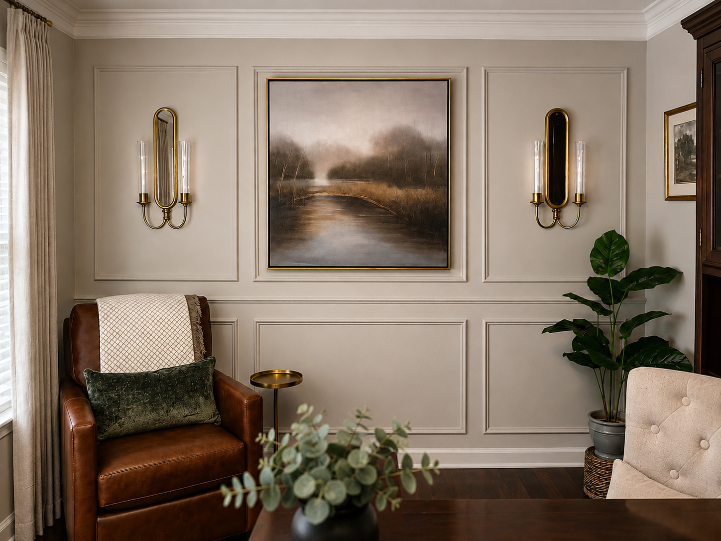
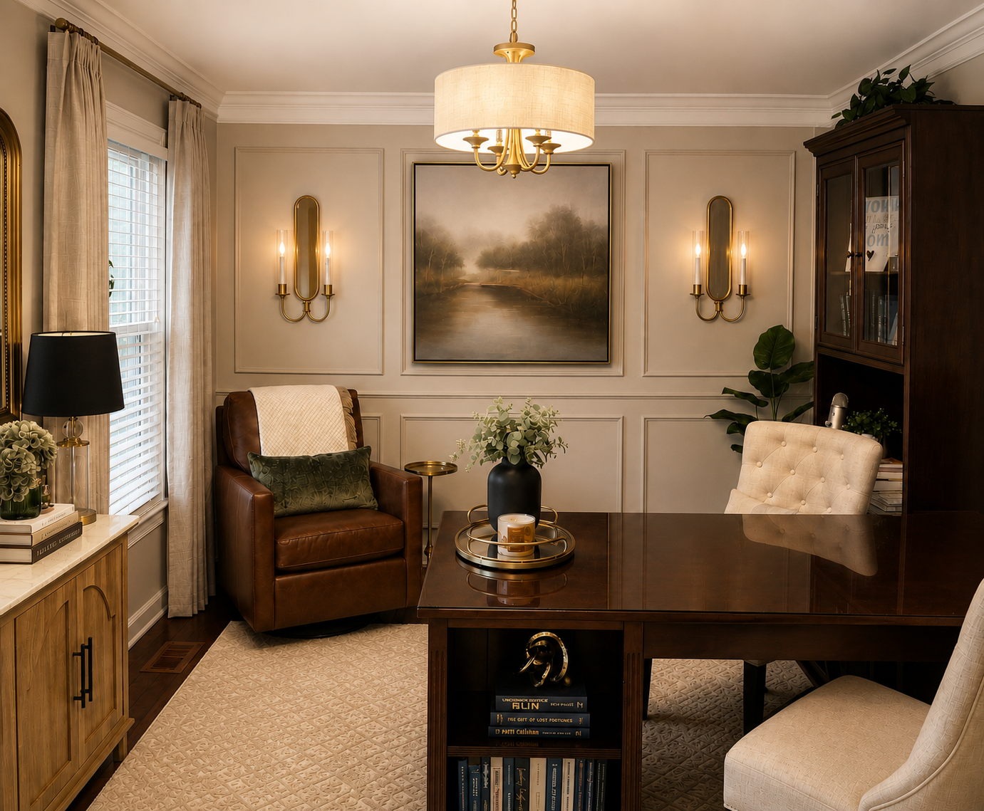
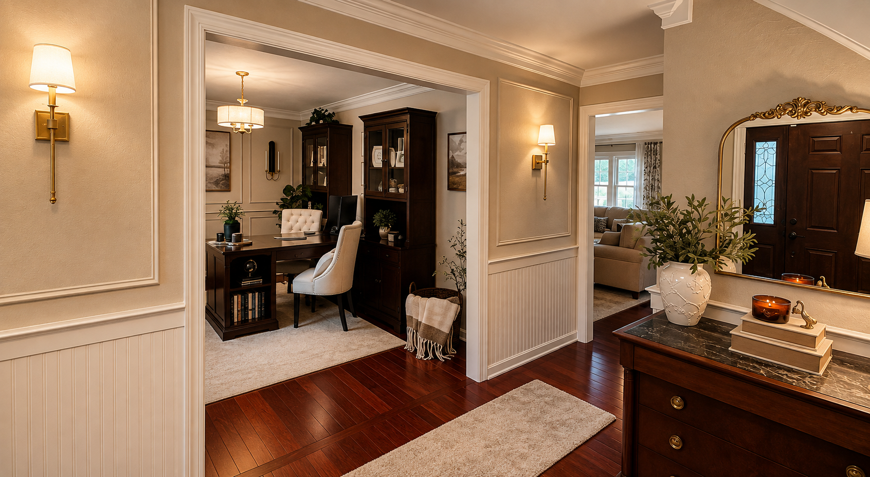
Accessible Beige is one of the colors I've used in more than one area of our home, including my home office and entryway.
And those two spaces are a perfect example of something I've learned about paint: the same color doesn't necessarily create the same room.
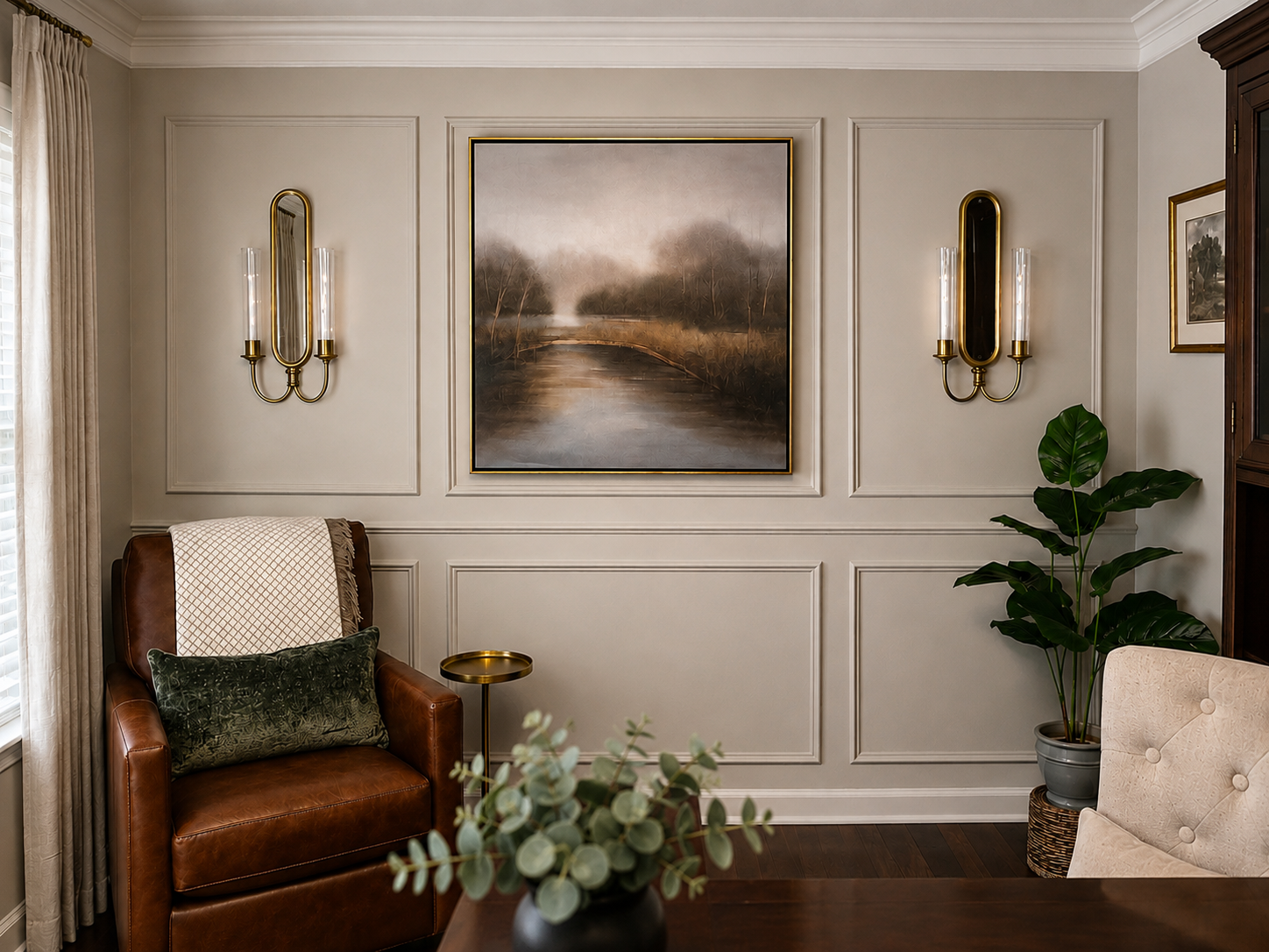
In my office, Accessible Beige is surrounded by dark wood furniture, a brown leather chair, ivory upholstery, antique brass lighting, soft greenery, and traditional artwork. The result feels warm, tailored, and a little moody without making the room feel dark.
In the entryway, the same paint color has a different personality.
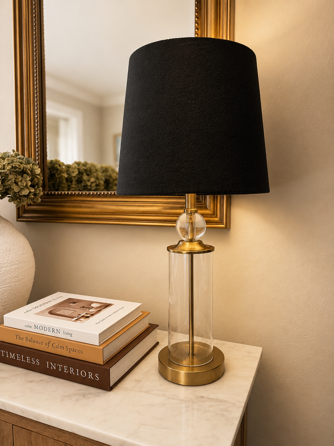
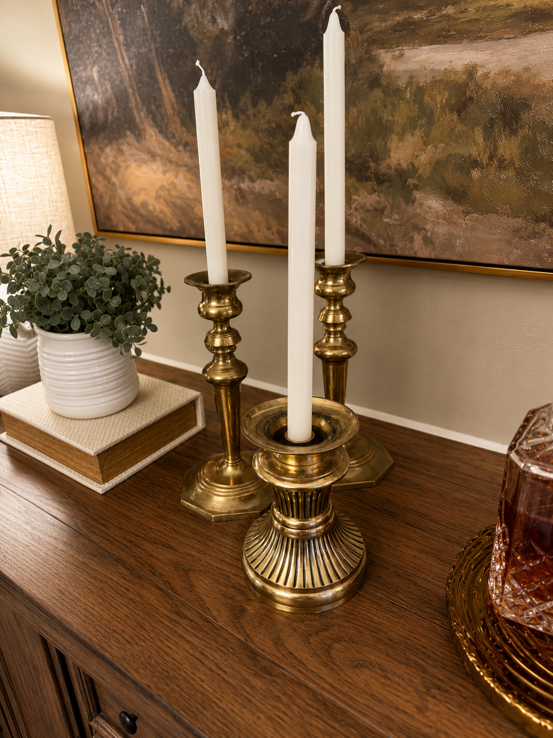
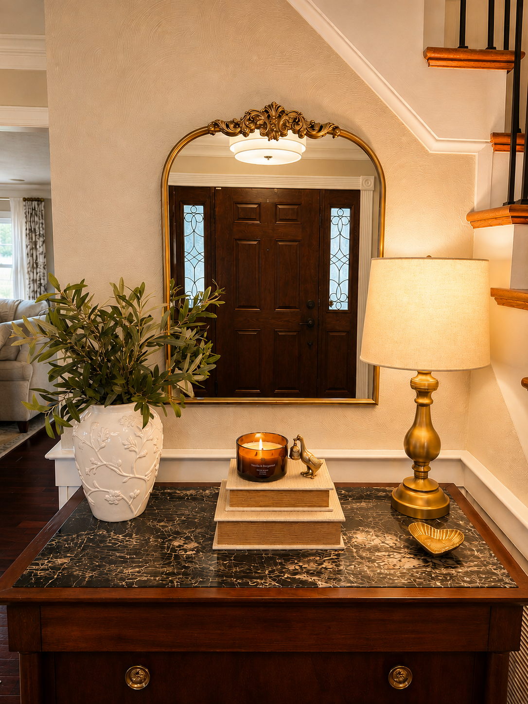
Here it's paired with the rich hardwood floors, white trim work, an antique-inspired gold mirror, brass lighting, and a dark marble-topped console. There are a lot of stronger finishes in this space, and Accessible Beige gives them a softer background.
That's one of the reasons I love this color.
It isn't the star of either room.
It lets everything around it be the star.
Benjamin Moore Pale Oak
Our living room called for something a little softer.
Pale Oak gave me that.
Compared with some of the deeper neutrals in our home, it feels lighter, which works especially well in a room where I wanted the overall feeling to be comfortable and relaxed.
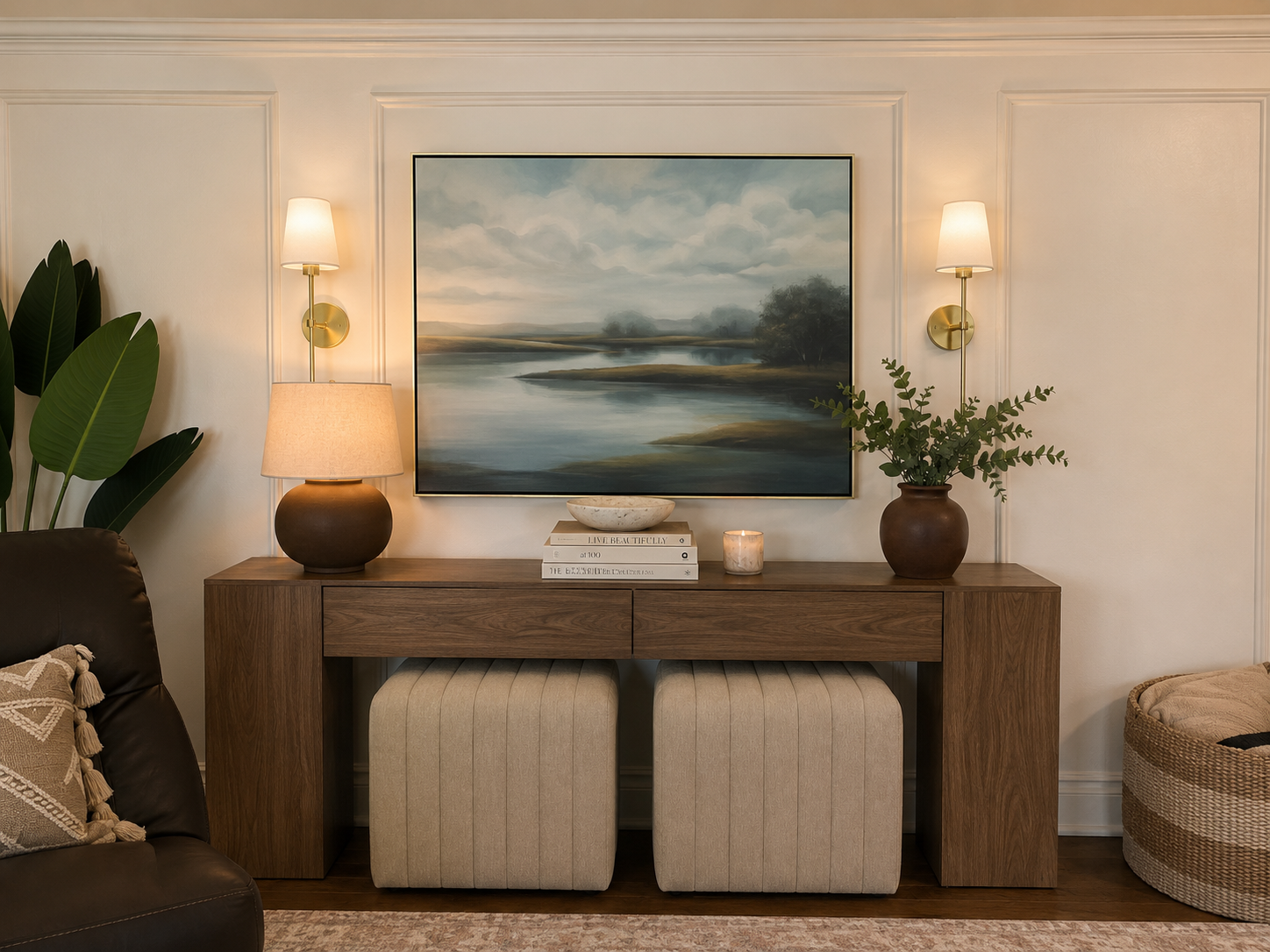
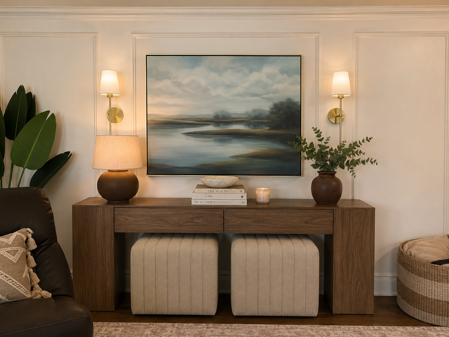
I love it with the cream upholstery, warm wood, brass, greenery, and darker accents throughout the room. There's still plenty of contrast, but the walls aren't asking for attention.
Pale Oak gives us a softer moment in the overall palette while still feeling completely at home next to the warmer rooms around it.
Benjamin Moore Pashmina
If Pale Oak is one of the softer neutrals in our home, Pashmina brings more depth.
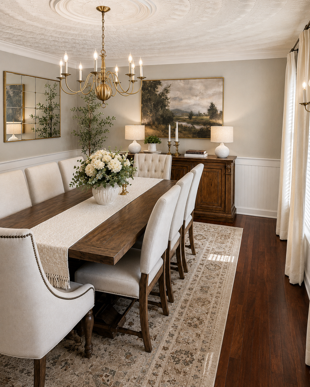
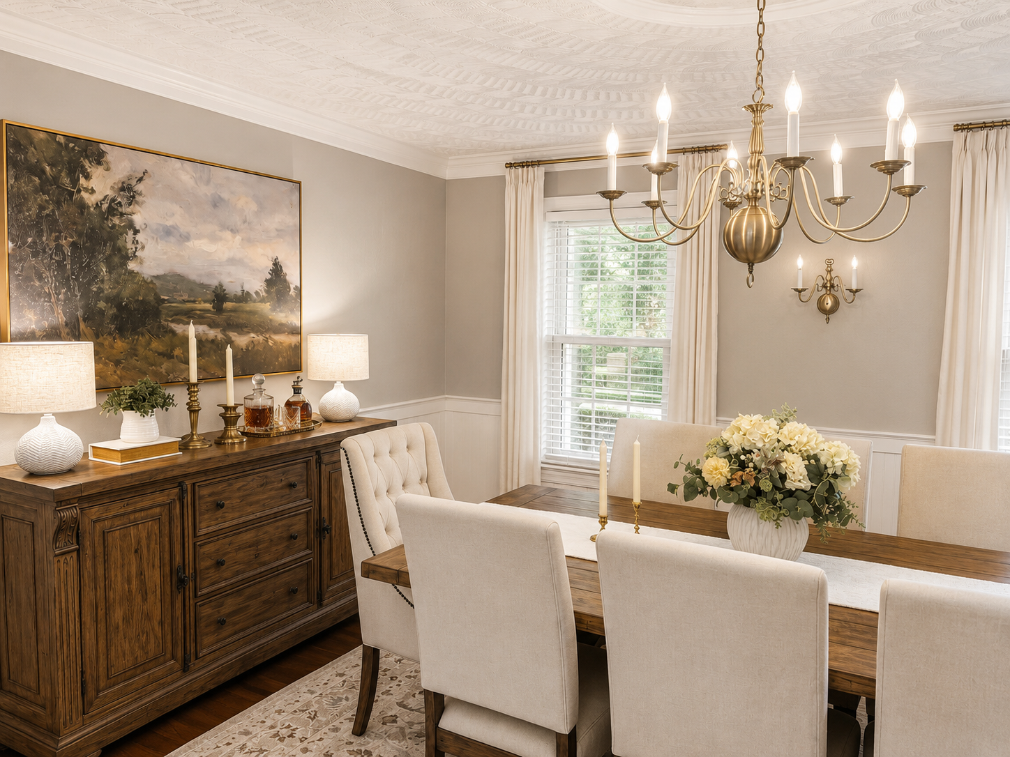
And that's exactly what I wanted in the dining room.
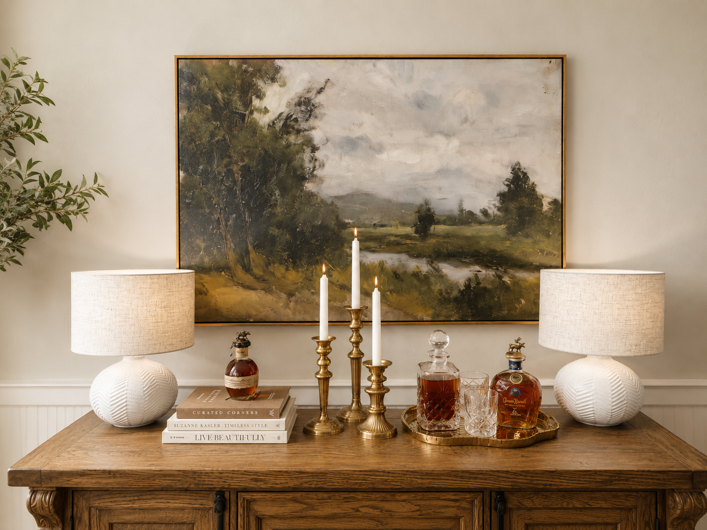
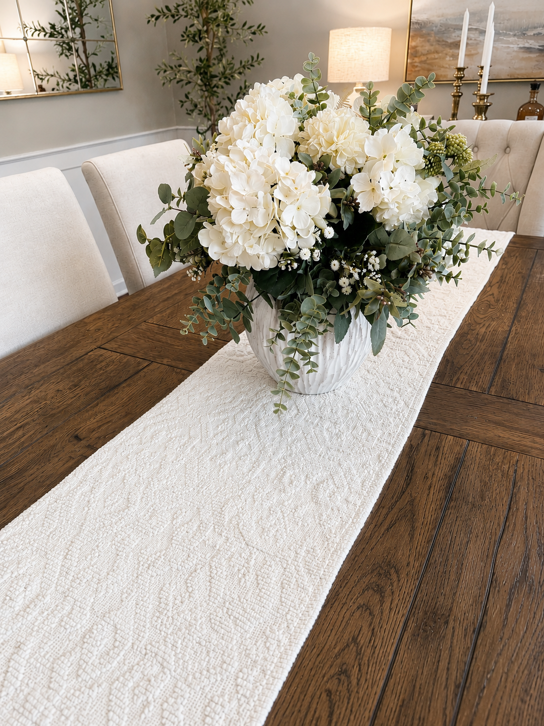
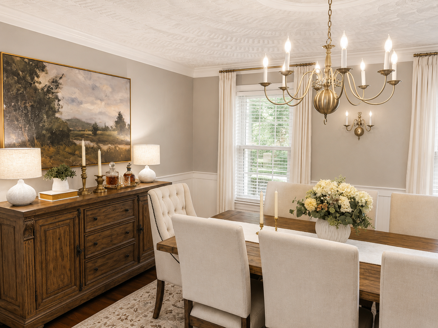
Our dining room includes warm wood furniture, cream upholstered chairs, brass lighting, traditional landscape artwork, white millwork, and plenty of texture. I considered going lighter, but I'm glad I didn't.
Pashmina gives the room presence.
It creates enough contrast against the white trim and millwork to highlight those architectural details, while still functioning as a neutral backdrop.
I especially love it in the evening.
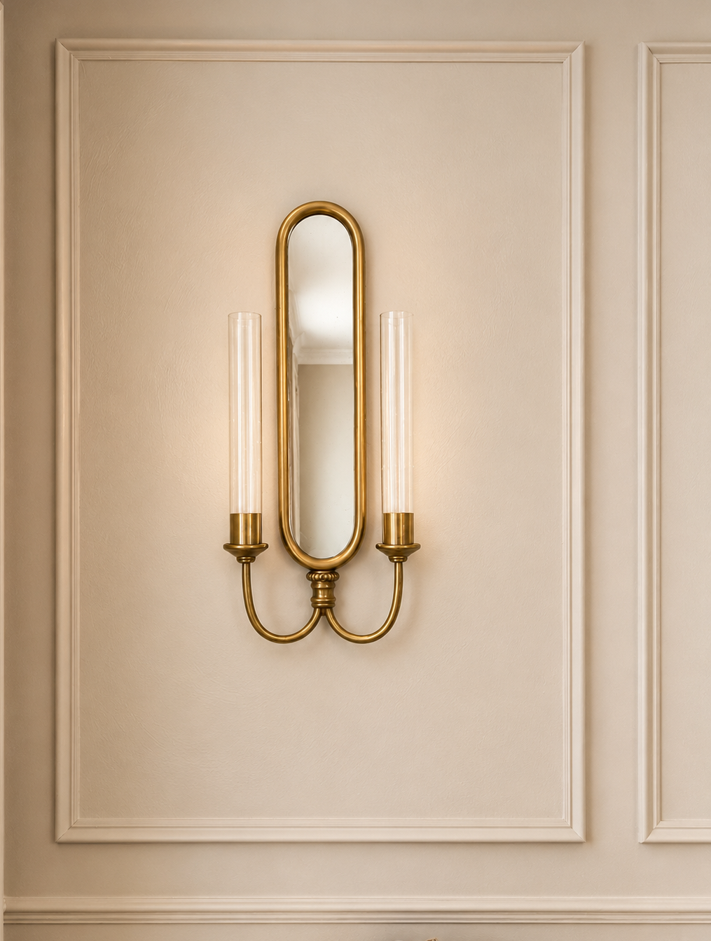
When the chandelier, sconces, and table lamps are on, the room becomes warmer and more intimate which is exactly how I want a dining room to feel.
This is also a good example of why I don't believe every room in an open or connected home has to be painted the same neutral.
Sometimes a room benefits from a little more depth.
The key is choosing colors that relate to one another rather than match one another.
My Warm Neutral Paint Palette at a Glance
If you're trying to understand how these colors function together, I think of them this way:
Accessible Beige — warm, versatile, and a wonderful backdrop for traditional rooms with richer materials.
Pale Oak — soft and subtle; beautiful when you want a lighter, quieter neutral.
Pashmina — deeper and more enveloping; especially beautiful when you want contrast and atmosphere.
White Dove — the soft white that ties the palette together through trim and millwork.
Why I Use Benjamin Moore White Dove Throughout Our Home
One thing I have kept consistent is Benjamin Moore White Dove.
I use it in a satin finish on the trim and millwork and flat on the ceilings. It's softer than a stark white, which works beautifully with the warmer wall colors and wood tones throughout our home.
Repeating it from room to room also gives me one consistent element even as the wall colors change.
None of these colors was chosen in isolation.
Together, they create a progression of lighter and deeper neutrals throughout the house without making every room feel the same.
Want to see the entire palette together?
I've created a free Layered Living with Laurie Warm Neutral Paint Palette with the exact colors and finishes I use throughout our home, plus some of my favorite ways to pair them with wood tones, brass, textiles, and other finishes.
How I Keep Warm Neutrals from Feeling Flat
A neutral room can absolutely feel boring, but I don't think neutral paint is usually the problem.
For me, the answer is layering.
I use darker wood and black for contrast, cream and ivory to keep things light, brass for warmth, and plenty of linen, leather, woven textures, greenery, artwork, and pattern.
And I don't try to make all of my neutrals match.
Cream can sit beside beige. Brown can sit beside ivory. Warm wood can sit beside black. Brass can sit beside greenery.
Those differences are what keep a neutral room interesting.
Three Neutral Rooms, Three Different Moods
How Warm Neutrals Let Me Decorate with Color
I can change the color story without changing the room.
My entryway is a perfect example.
Most of the year, I style the console with greenery, warm wood tones, cream accessories, and brass.
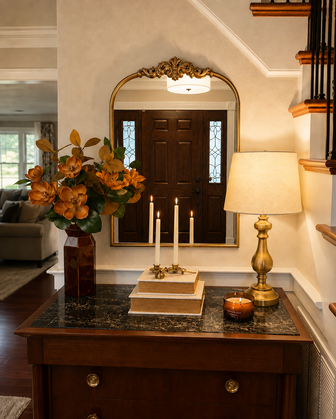
In autumn, I can bring in richer caramel, amber, rust, brown, and deeper greens.
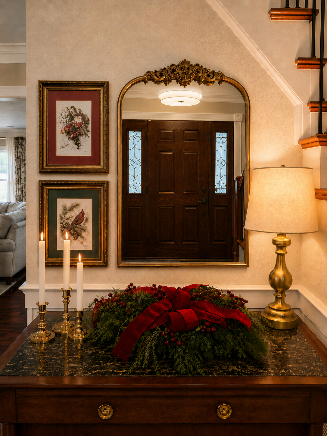
At Christmas, I bring in deep reds, evergreen, berries, velvet ribbon, and more traditional holiday artwork.
The wall color doesn't compete with any of it.
Instead, Accessible Beige becomes the backdrop that allows those seasonal colors to come forward.
That's why, even though I describe my home as neutral, I don't really think of it as colorless.
The neutral palette gives me the opportunity to use color where I can easily change it.
Artwork. Flowers. Pillows. Throws. Seasonal decor. Even the books and small objects I use in a vignette.
The foundation stays timeless while the layers can evolve.
What I've Learned About Choosing Warm Neutral Paint
After living with these colors, there are a few things I've learned about choosing a warm neutral.
Always sample the paint in your own room.
A paint color you've seen dozens of times online can behave very differently in your house.
Look at it throughout the day.
Morning light, afternoon light, artificial light, and even the direction your windows face can change your perception of a neutral.
Start with the things you aren't planning to change.
Floors, cabinetry, countertops, fireplaces, large pieces of furniture, and woodwork all influence how a paint color reads.
Think beyond one room.
Stand in the doorway and look into the adjoining space. Can you see two or three wall colors at once? If so, they don't have to match, but they should feel like they belong to the same home.
And finally:
Don't be afraid of a little depth.
I think there can be a tendency to keep going lighter and lighter when choosing neutrals because it feels safer.
But some rooms come alive with a slightly deeper color.
That's certainly been true in our dining room.
Final Thoughts
I've made plenty of paint mistakes over the years, but living with these colors has taught me to pay much more attention to the home in front of me rather than the color everyone else seems to be using.
Accessible Beige, Pale Oak, and Pashmina each give our rooms a slightly different feeling, while White Dove quietly connects them from one space to the next.
And although our walls are neutral, our home certainly isn't colorless.
The seasons change. The greenery changes. Pillows, artwork, flowers, and little things around the house come and go.
The walls simply give me the freedom to do it.
If you're trying to choose a warm neutral for your own home, start with what you already have. Look at your floors, furniture, natural light, and the rooms around it.
Then bring home some samples and live with them for a while.
You may be surprised by the color you end up loving.
See These Paint Colors in My Home
Sherwin-Williams Accessible Beige
See it in my Home Office Transformation and Entryway TransformationBenjamin Moore Pale Oak
See it in my Living Room TransformationBenjamin Moore Pashmina
See it in my Dining Room Transformation